The Cooks Kitchen
\Wireframe designs
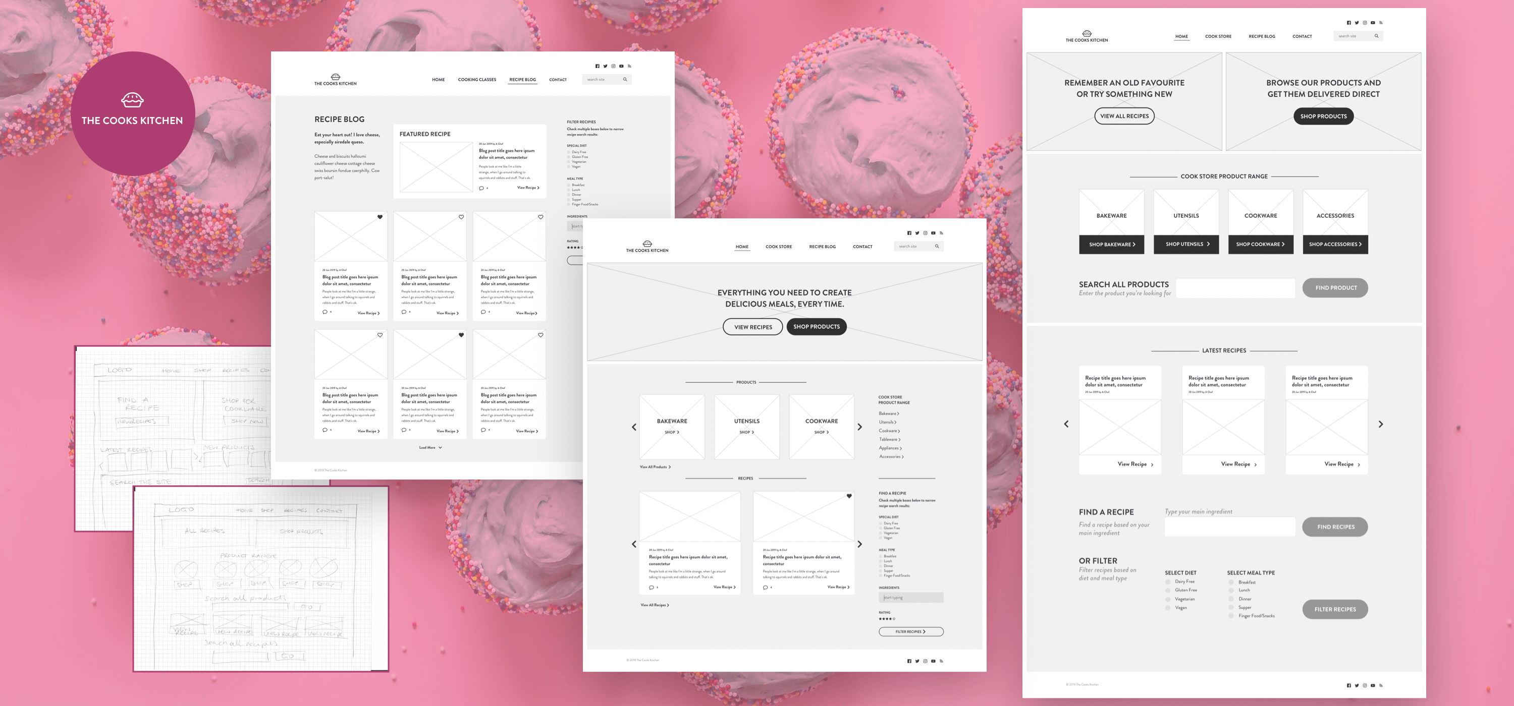
The Project
The Cooks Kitchen sell baking supplies in store and online. They decided to add a blog to their website, to assist with their inbound marketing and search engine optimisation (SEO) strategy, and to encourage visitors to purchase more supplies.
Together with internal stakeholders, we established the information architecture and created hand-drawn sketch options to help visualise the new layout. The final low-fidelity wireframe was created in greyscale, and included recent posts/recipes, featured recipe and advanced search and filter options via a simple, conventional layout including a header, footer and sidebar.
After reviewing the designs, we discussed alternative options with the client, which could further support the business goals:
1. How might we draw the users’ attention to available tools for purchase whilst they are browsing recipes?
We added Cook Store to the main navigation. Further exploration would be advisable as to whether this would be the correct term – tools and products were other potential options.
The hero area now has a clear UVP with a primary and secondary call to action. They are designed to help the user find what they are looking for but also to them know that they can shop for products on the website.
The next level is a carousel displaying 3 of the available product categories, each includes a call to action encouraging users to shop and an image displaying products from that category. In addition, the sidebar has links to all categories within the product range.
2. How might we increase the audience of tech-savvy elderly women? What features and design elements might appeal to an older audience?
Being tech-savvy doesn’t mean you can still use a website easily. As we age, or motor skills, hearing, eyesight and memory can all deteriorate, so these are some of the things we must keep in mind when designing for an older audience.
We moved the sidebar content into the flow of the layout, to simplify the outcome and make it easier for visitors to scan the content. We deliberately removed the first few lines of the recipe/post for the same reason, and to allow more white space around the link.
Keeping in mind the company’s need to increase awareness of its product range, the top area of the site has 2 clear calls to action, one for recipes and one for products.
The second section is focussed on the products/tools, with large buttons and additional white space, to ensure the links are easily seen and easily accessed. A search function here will allow the user to search for a specific product from the range, getting them where they want to be with a few clicks as possible.
The third section showcases the latest recipes, again with plenty of space around the links so they are easy to select. Allowing the user to look for a recipe by searching its title or main ingredient will help them move quickly to the content they are looking for. An alternative option has been provided so users can filter based on diet and meal type if they prefer. In both cases, buttons are large, form fields easy to select and instructions are provided, to help the user complete the task.